Info cards
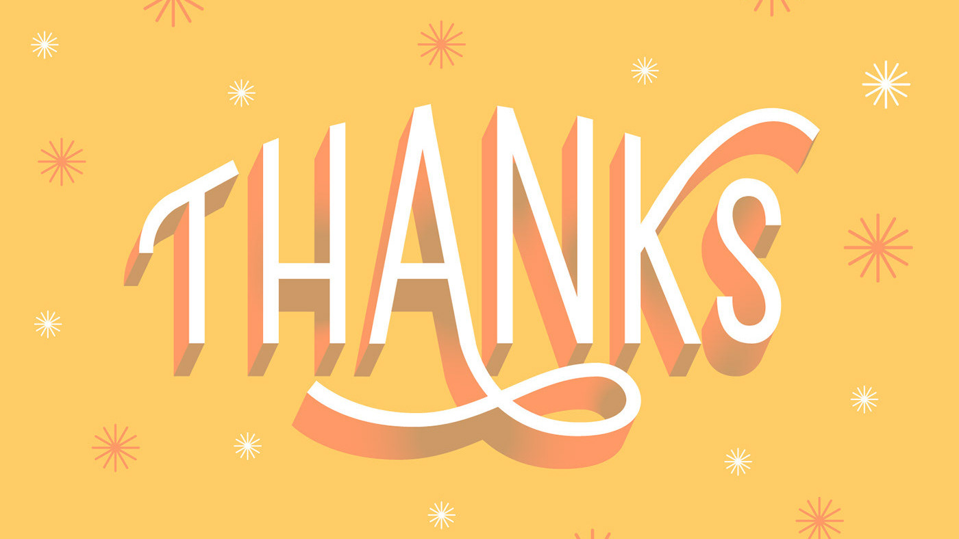
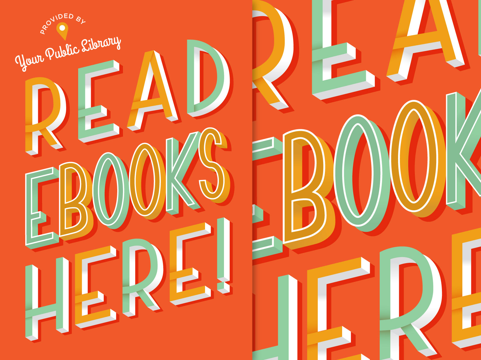
This is the current design used in marketing assets that we send to the libraries that have signed up for the service. I wanted to do a version with lettering and was given the opportunity to when it was suggested to change up the previous design I had done in order to keep things fresh. I was then given a phrase and full creative freedom. All the type in the phrase was created by me, except for the script at the top.
This is a graphic I created to be used on small pieces like FAQs to as large as wraps on our reception desk at our booths for trade shows. The hands are also used independently from each other in ads and informational brochures.
The term "pop up" implies playfulness and spontaneity to me, which is why I went with a really loose, sketched feel for the illustrations and kept rough edges. I wanted it to be eye-catching, but I also wanted to also convey the variety of people that are reading as well as the variety of genres being read, hence the different patterns/colors behind each hand.
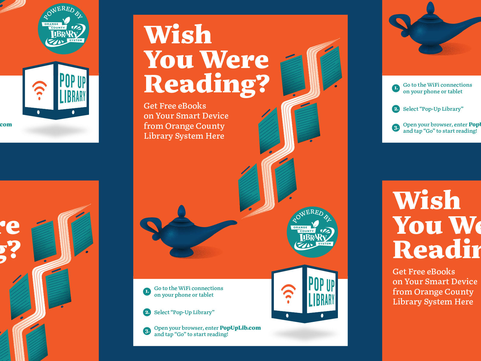
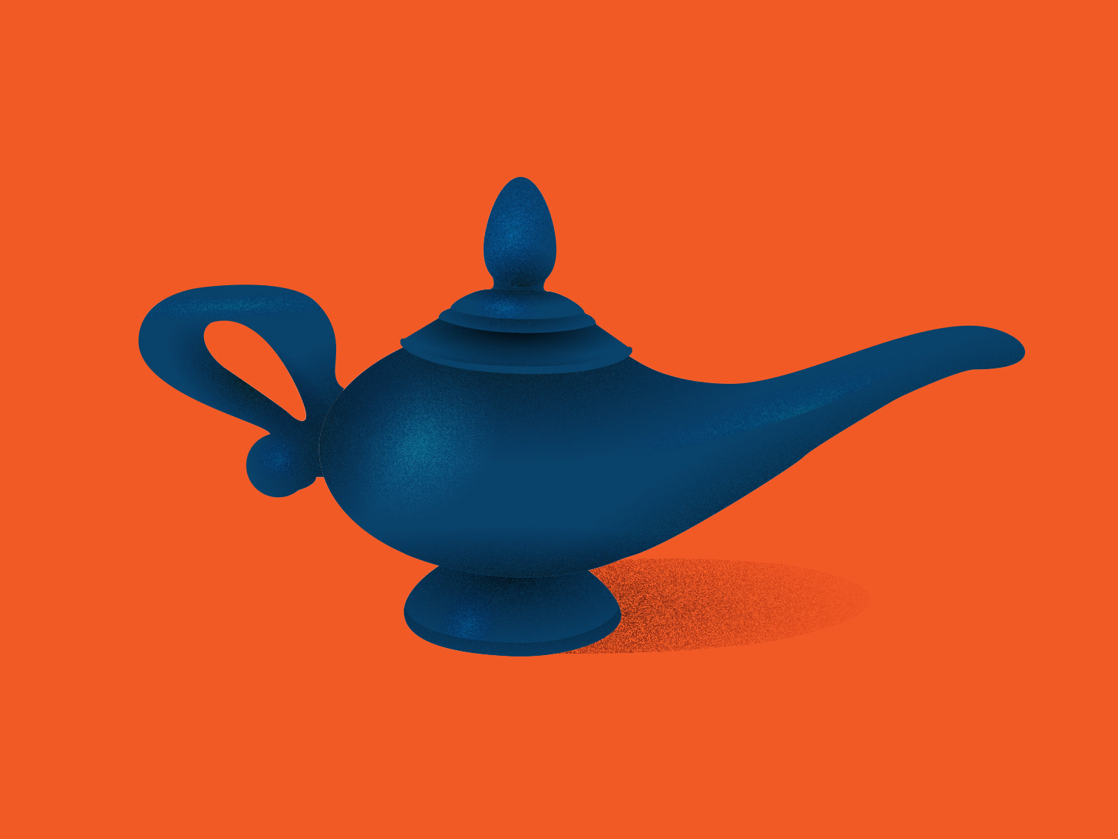
Above is an image from the first round of assets that ended up getting taken out of the mix earlier on. I was really proud of the way this one turned out, but I think it was a little too abstract for some. I wanted the smoke from the genie lamp to feel like pages of a book, but then also act as the outlines of tablets.


These were digital ads created in collaboration with the people at DC Public Library's service goDigital. They were displayed at Union Station during ALA (American Library Association) in 2019.

